
Creation is Messy Frit Reference
| CiM 1 | CiM 2 | CiM 3 |
 |
 |
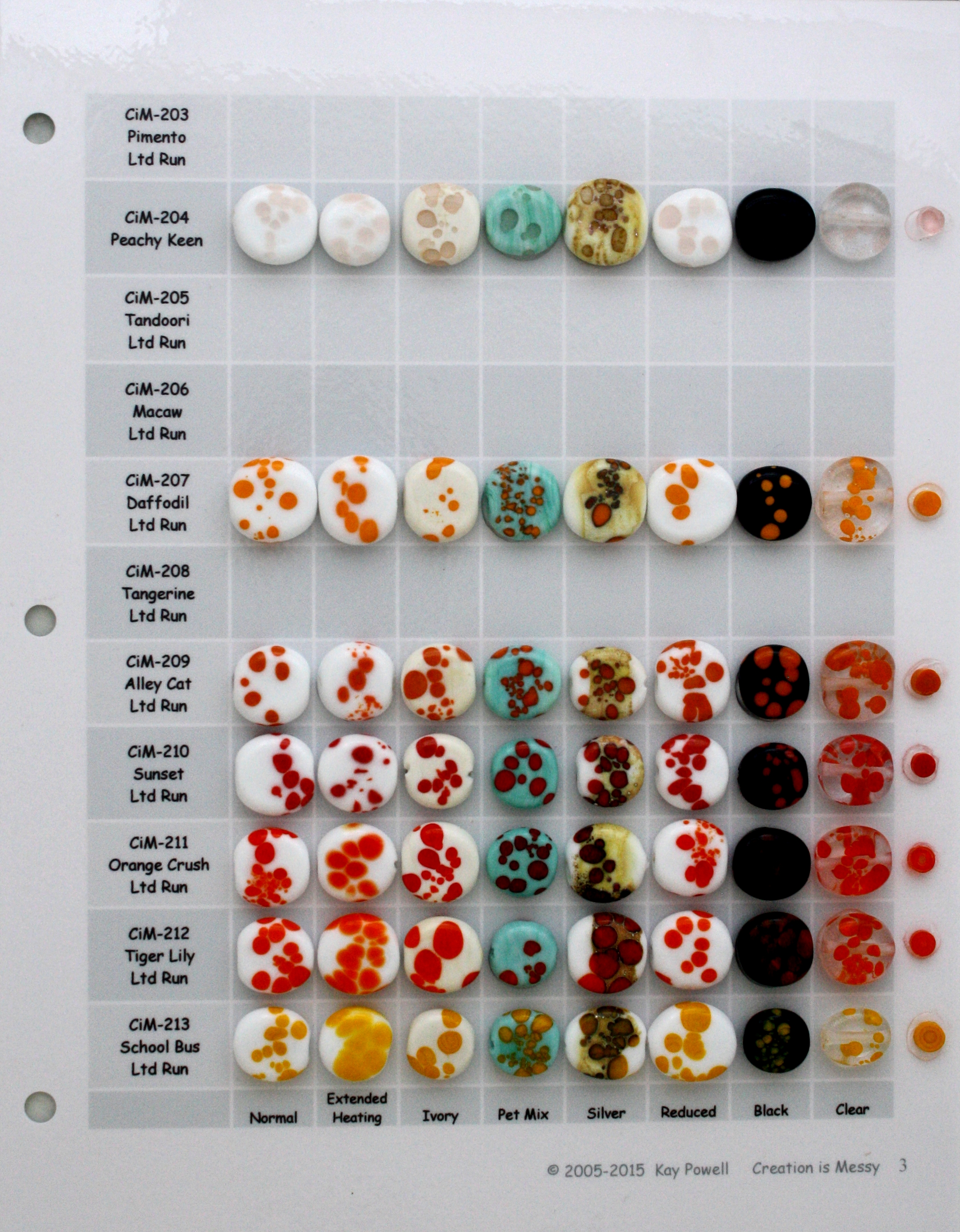 |
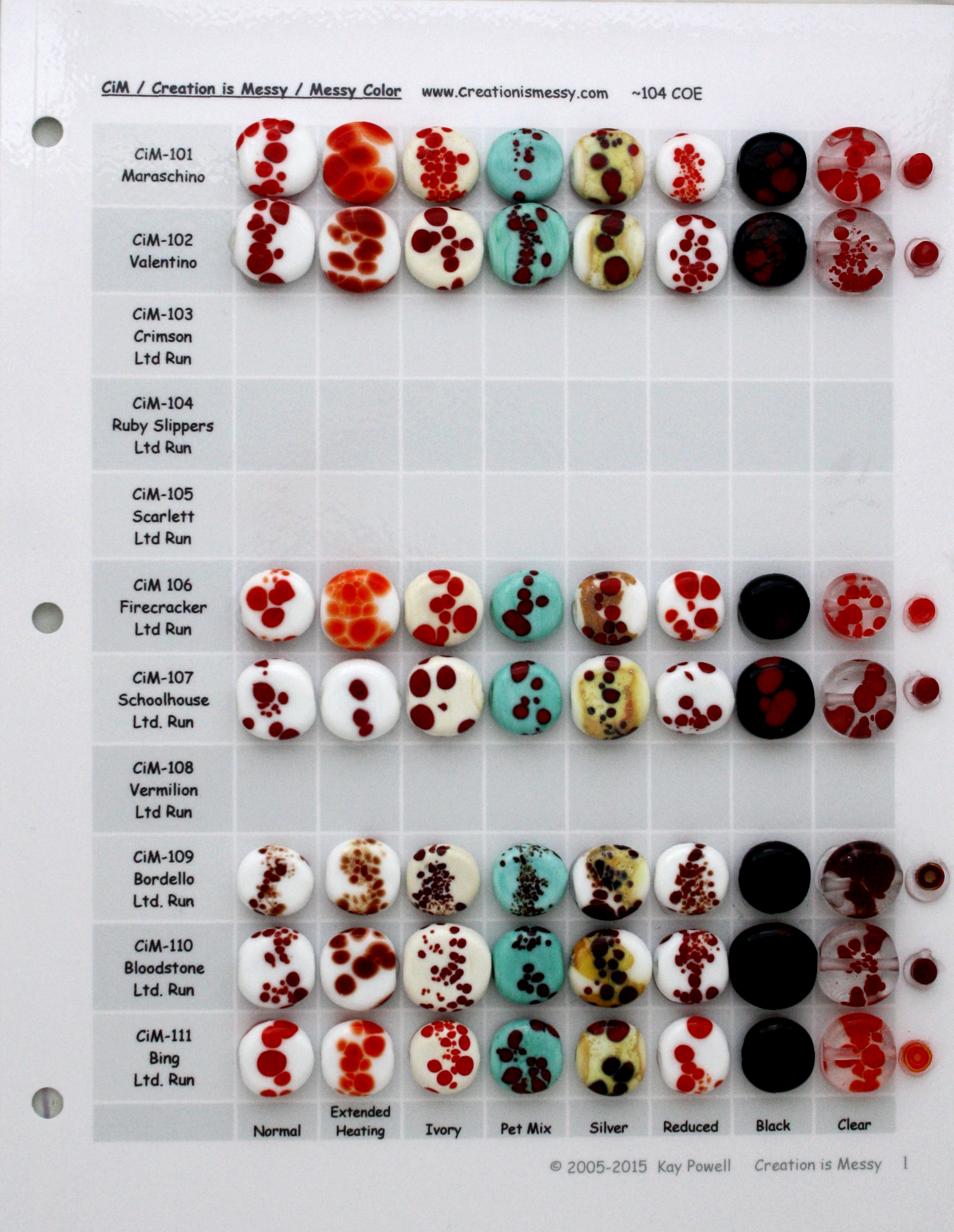
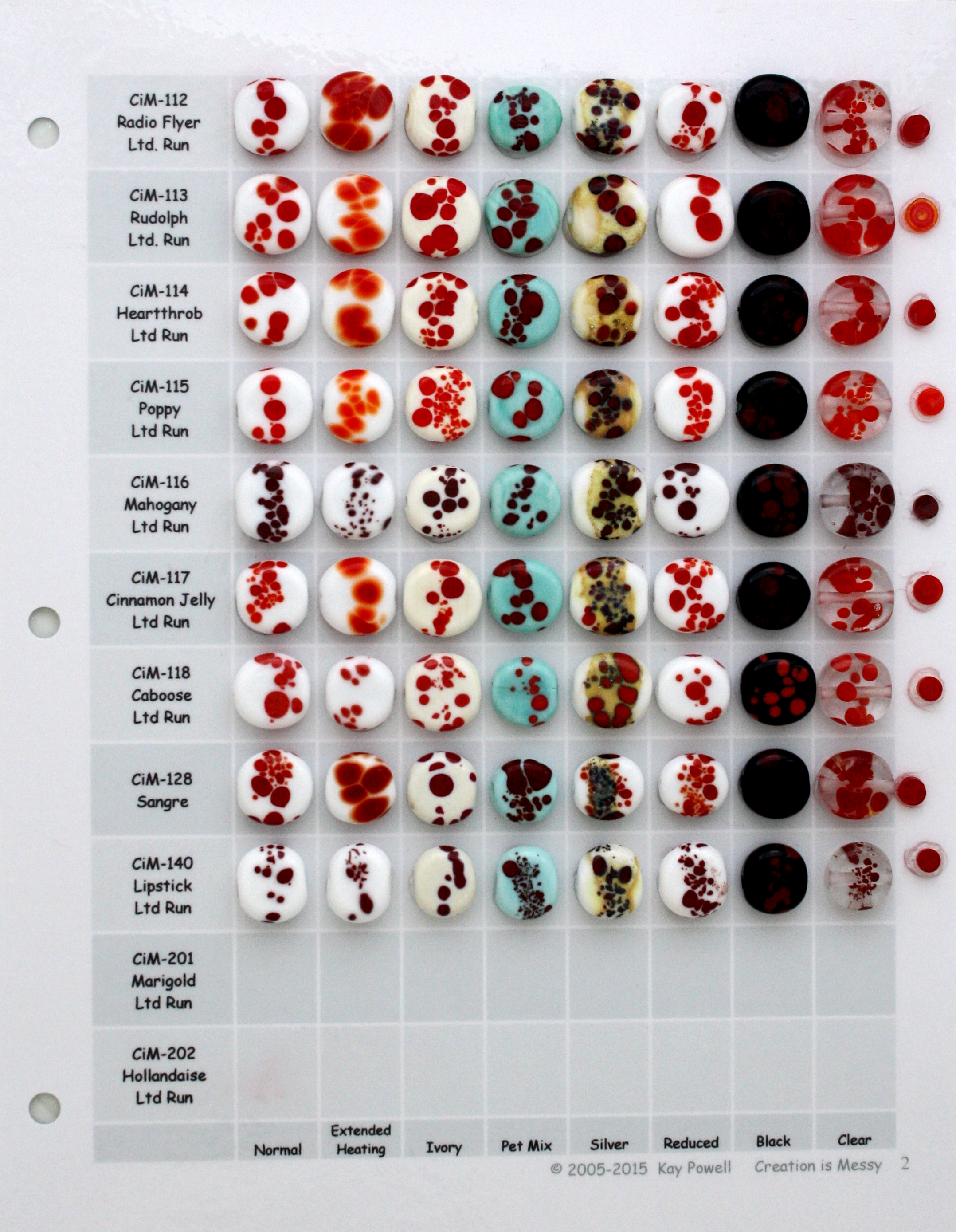
| 101-111 | 112-202 | 203-213 |
| CiM 4 | CiM 5 | CiM 6 |
 |
 |
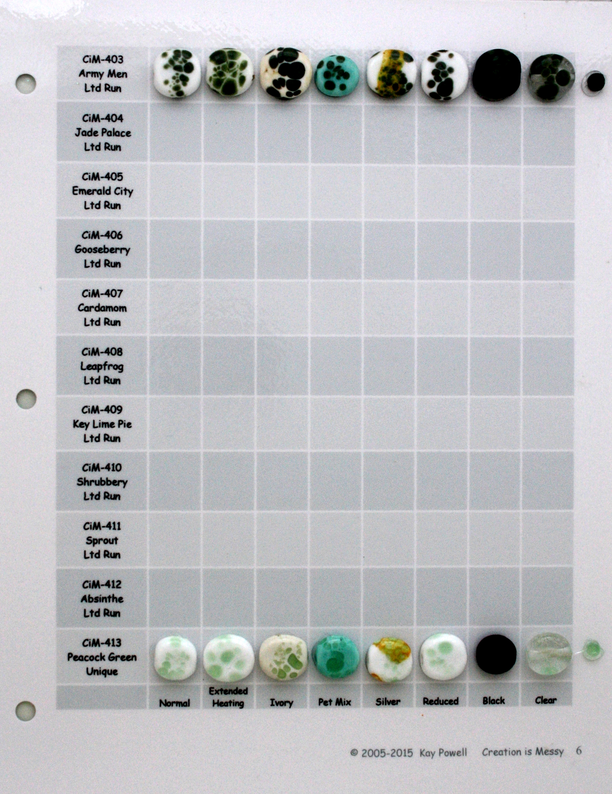 |
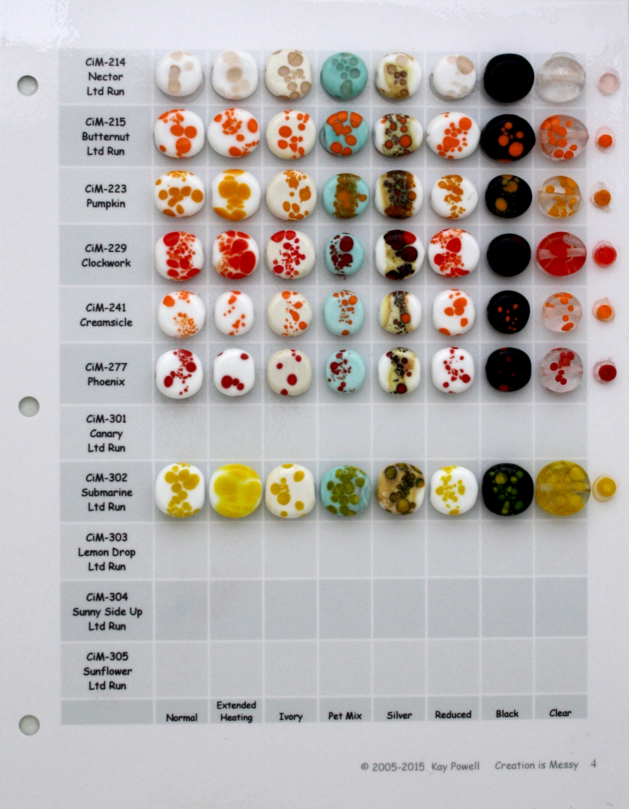
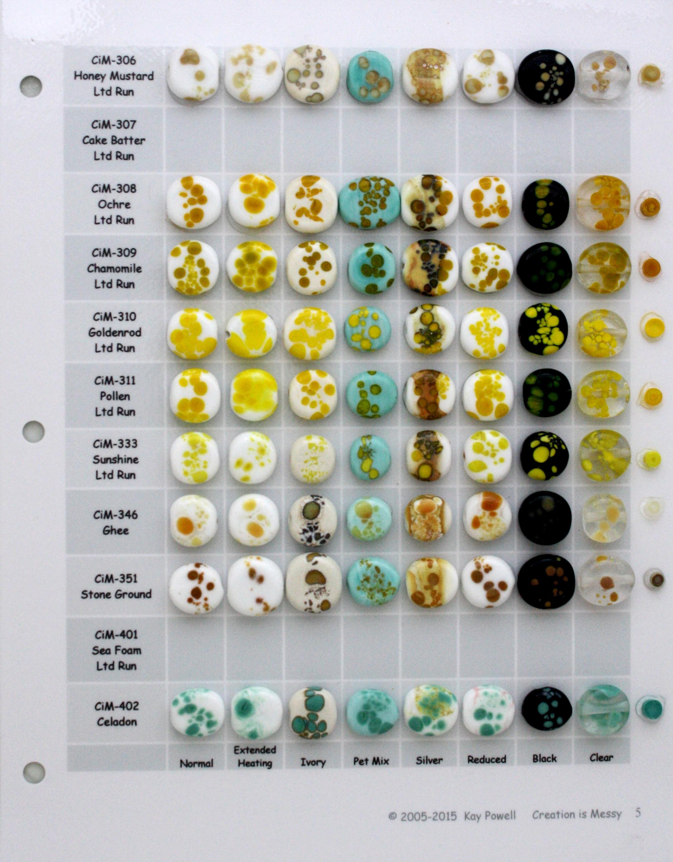
| 214-305 | 306-402 | 403-413 |
| CiM 7 | CiM 8 | CiM 9 |
 |
 |
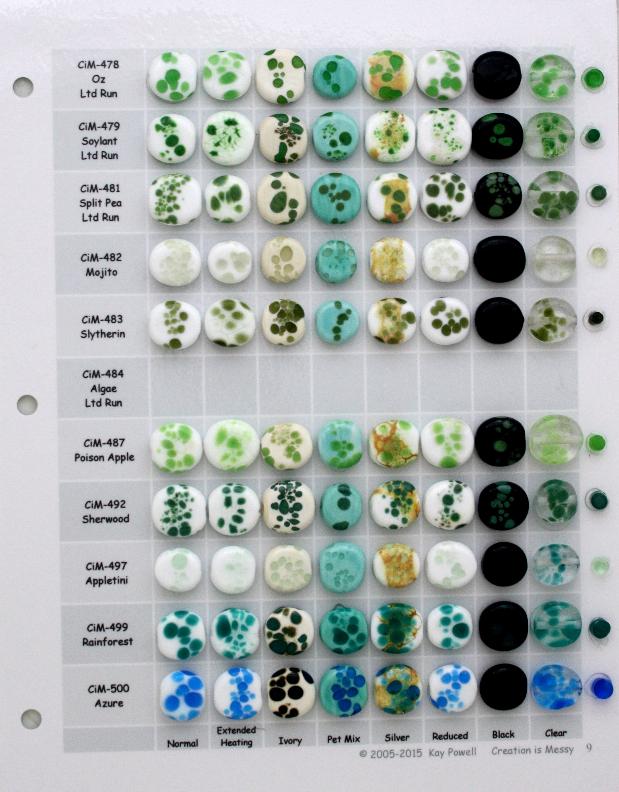 |
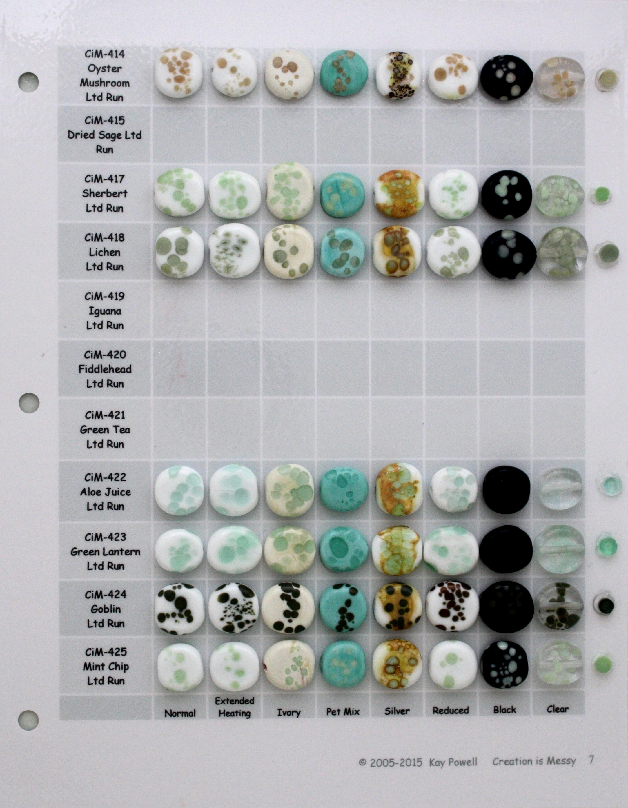
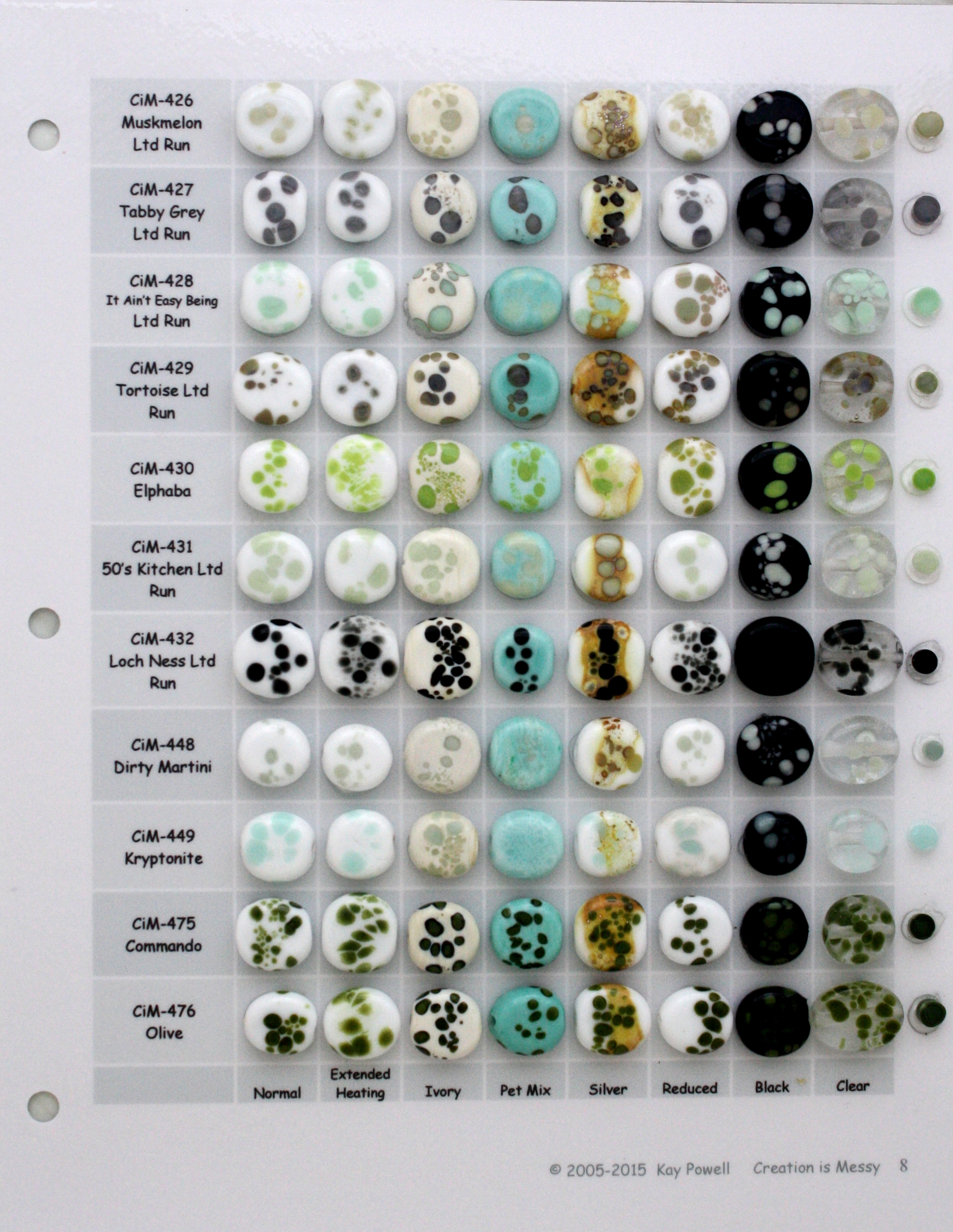
| 414-425 | 426-476 | 478-500 |
| CiM 10 | CiM 11 | CiM 12 |
 |
 |
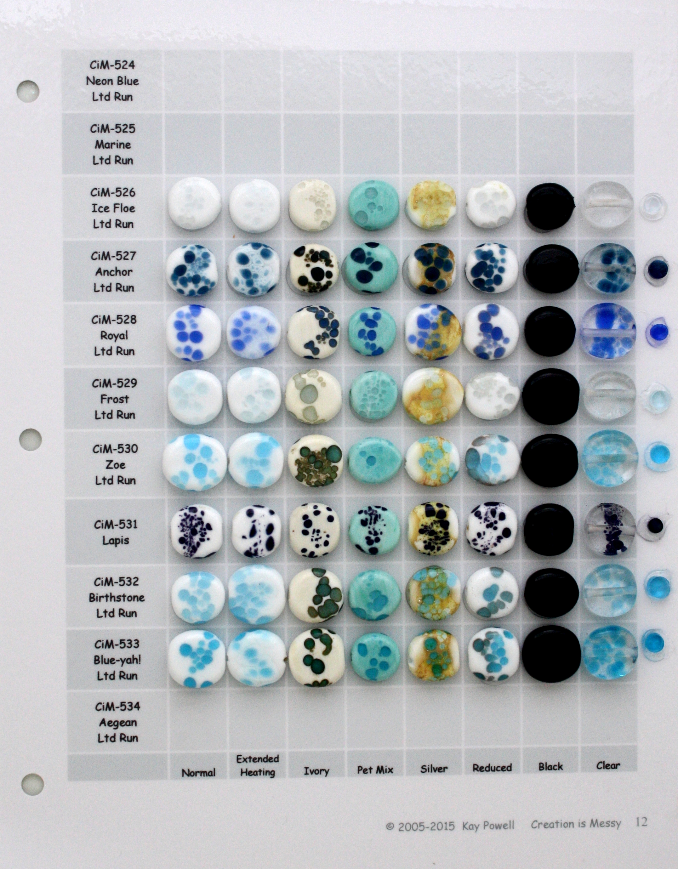 |
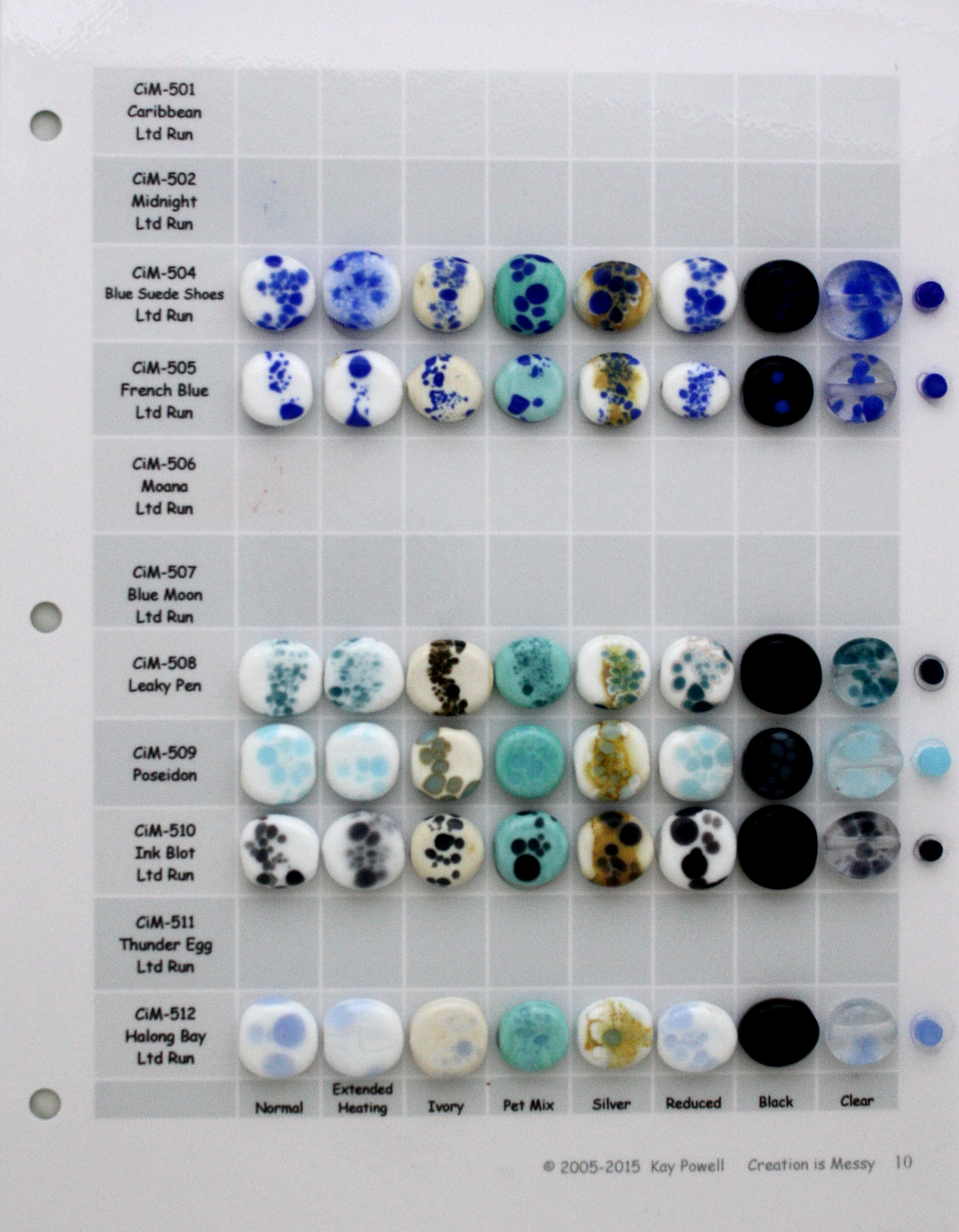
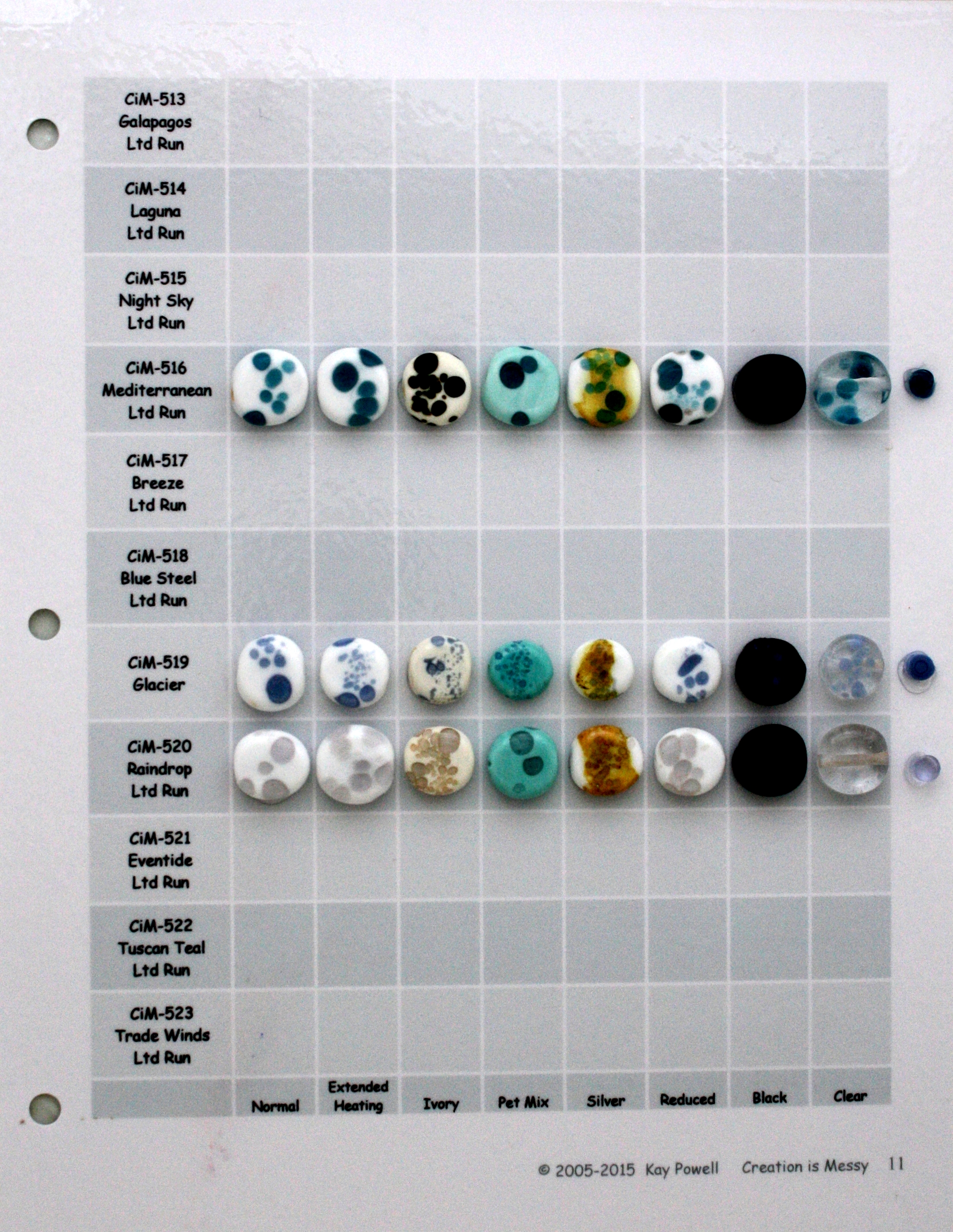
| 501-512 | 513-523 | 524-534 |
| CiM 13 | CiM 14 | CiM 15 |
 |
 |
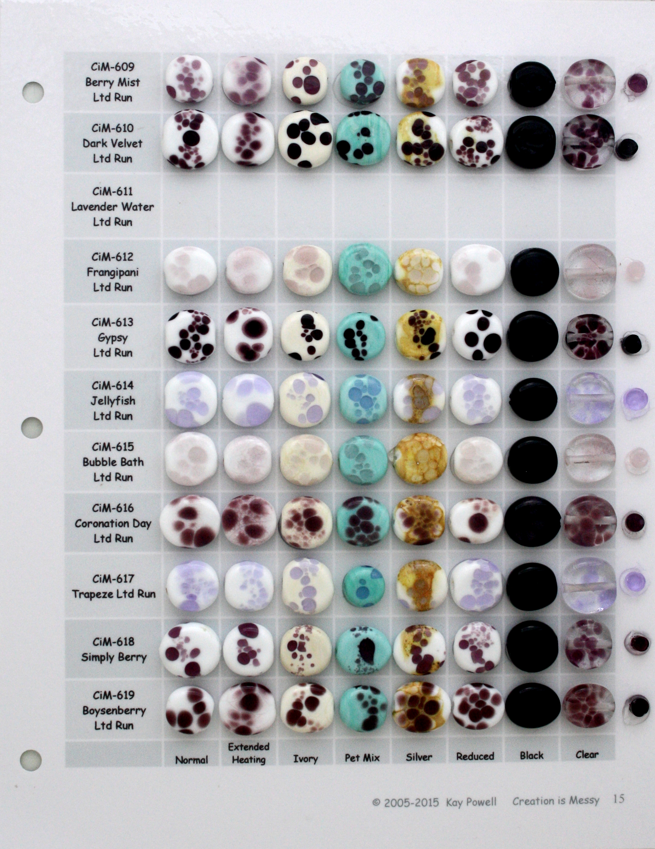 |
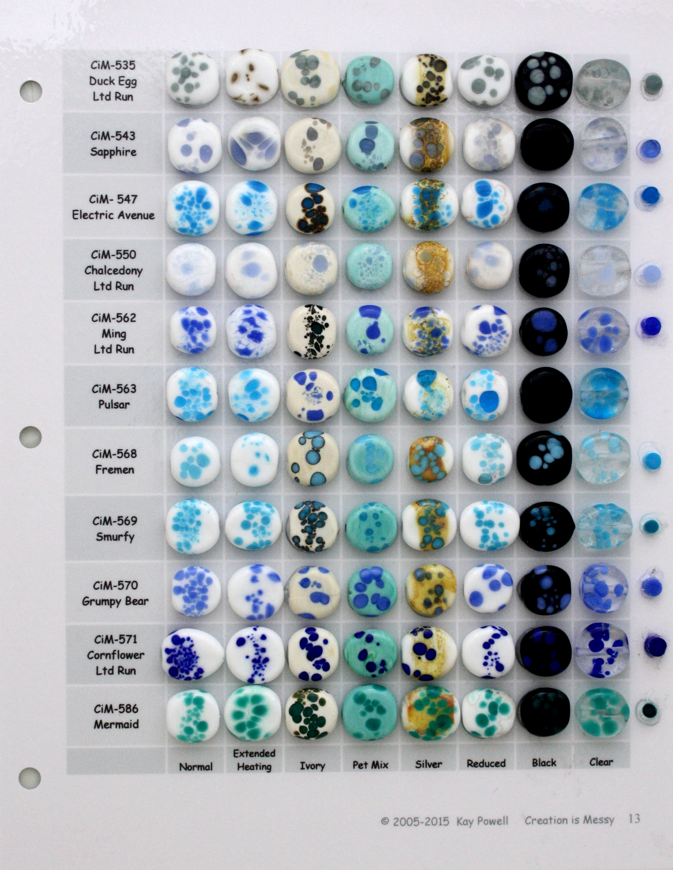
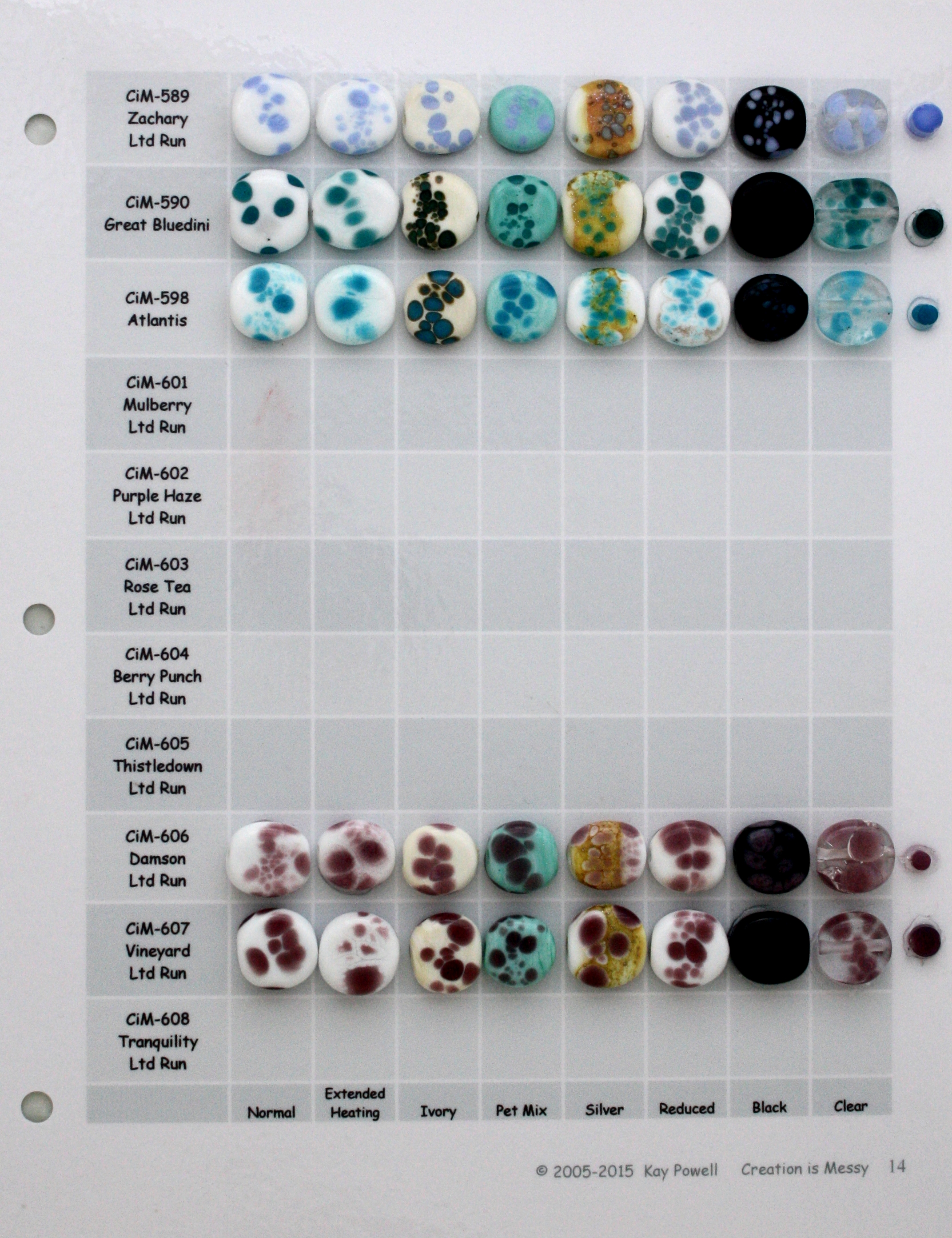
| 535-586 | 589-608 | 609-619 |
| CiM 16 | CiM 17 | CiM 18 |
 |
 |
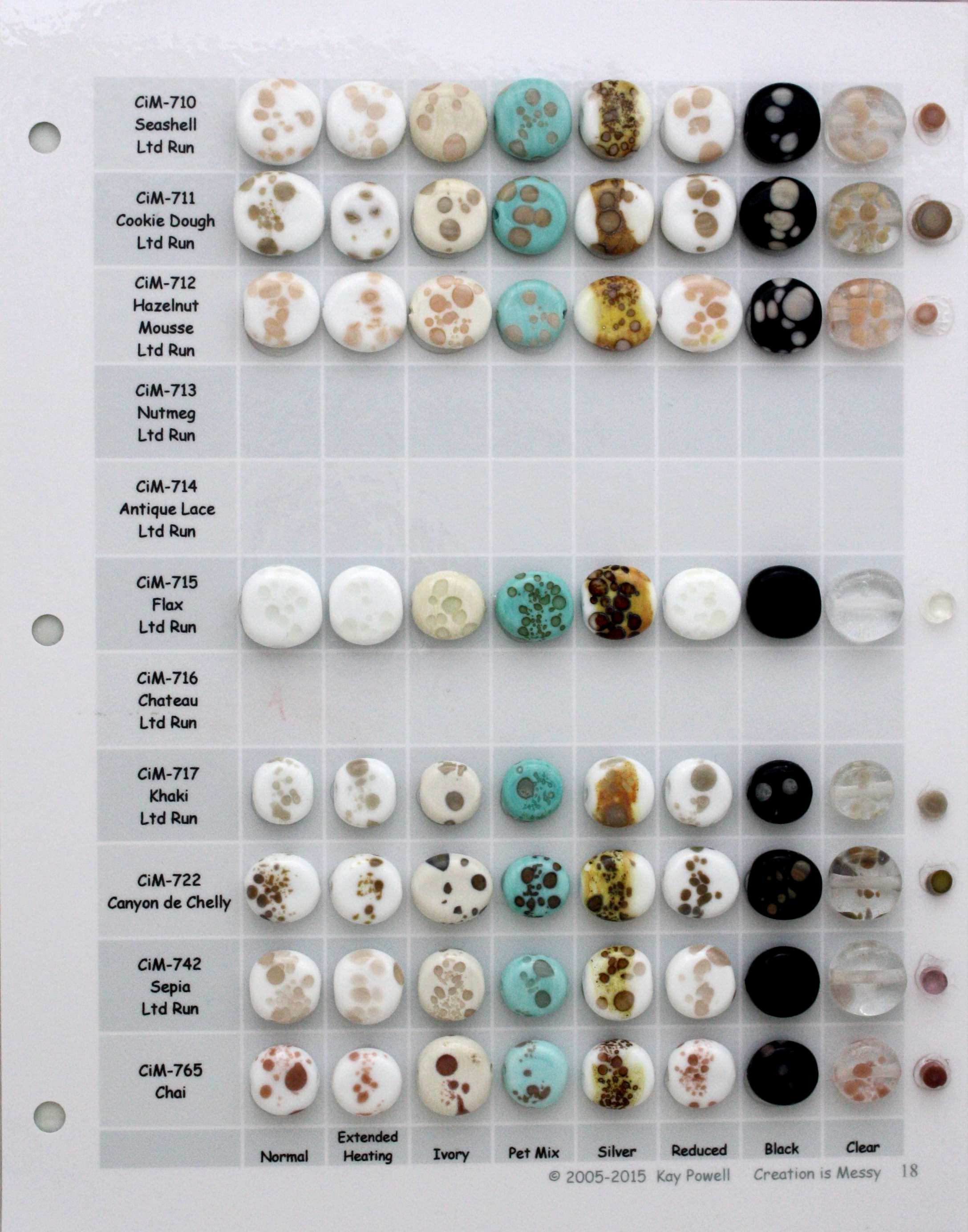 |
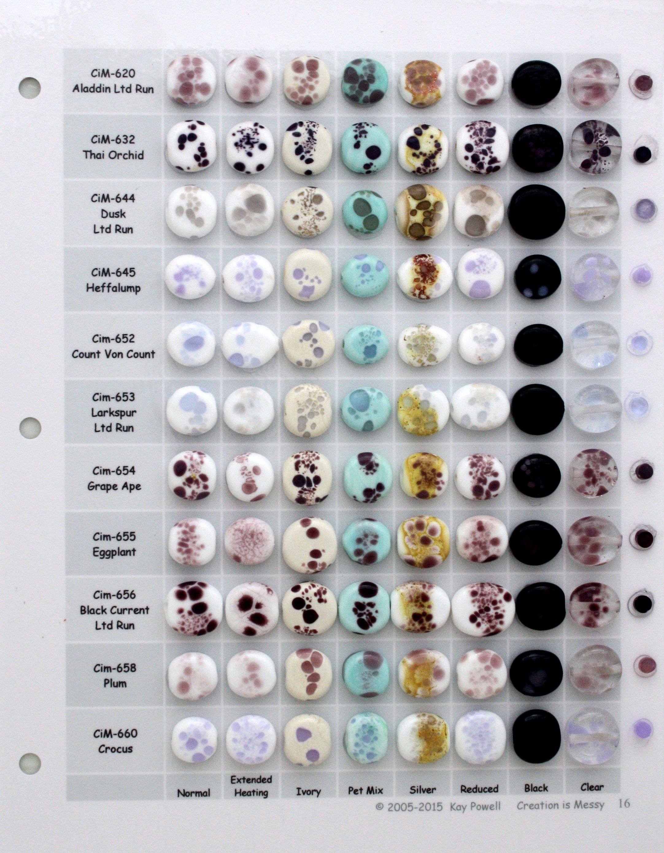
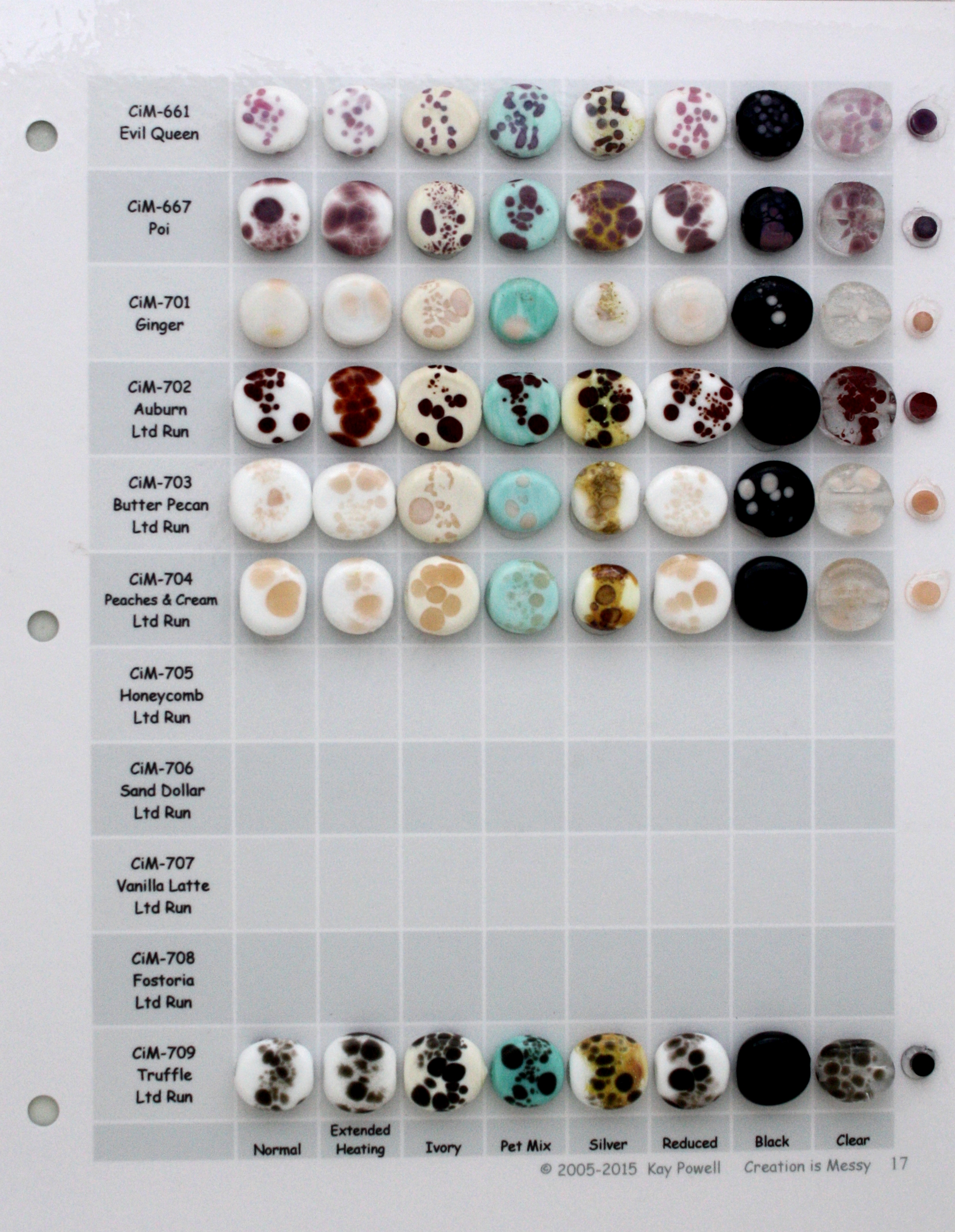
| 620-660 | 661-709 | 710-765 |
| CiM 19 | CiM 20 | CiM 21 |
 |
 |
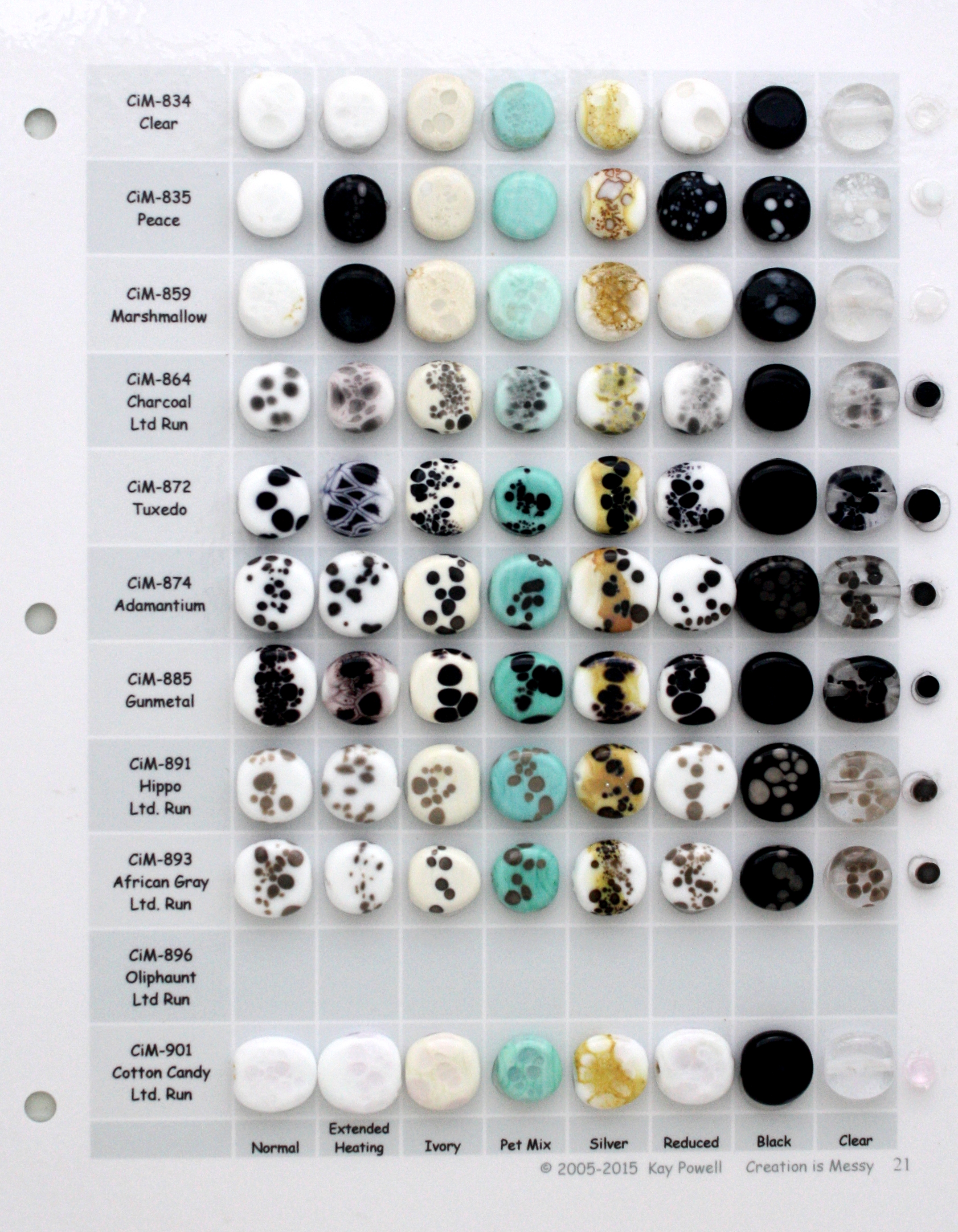 |
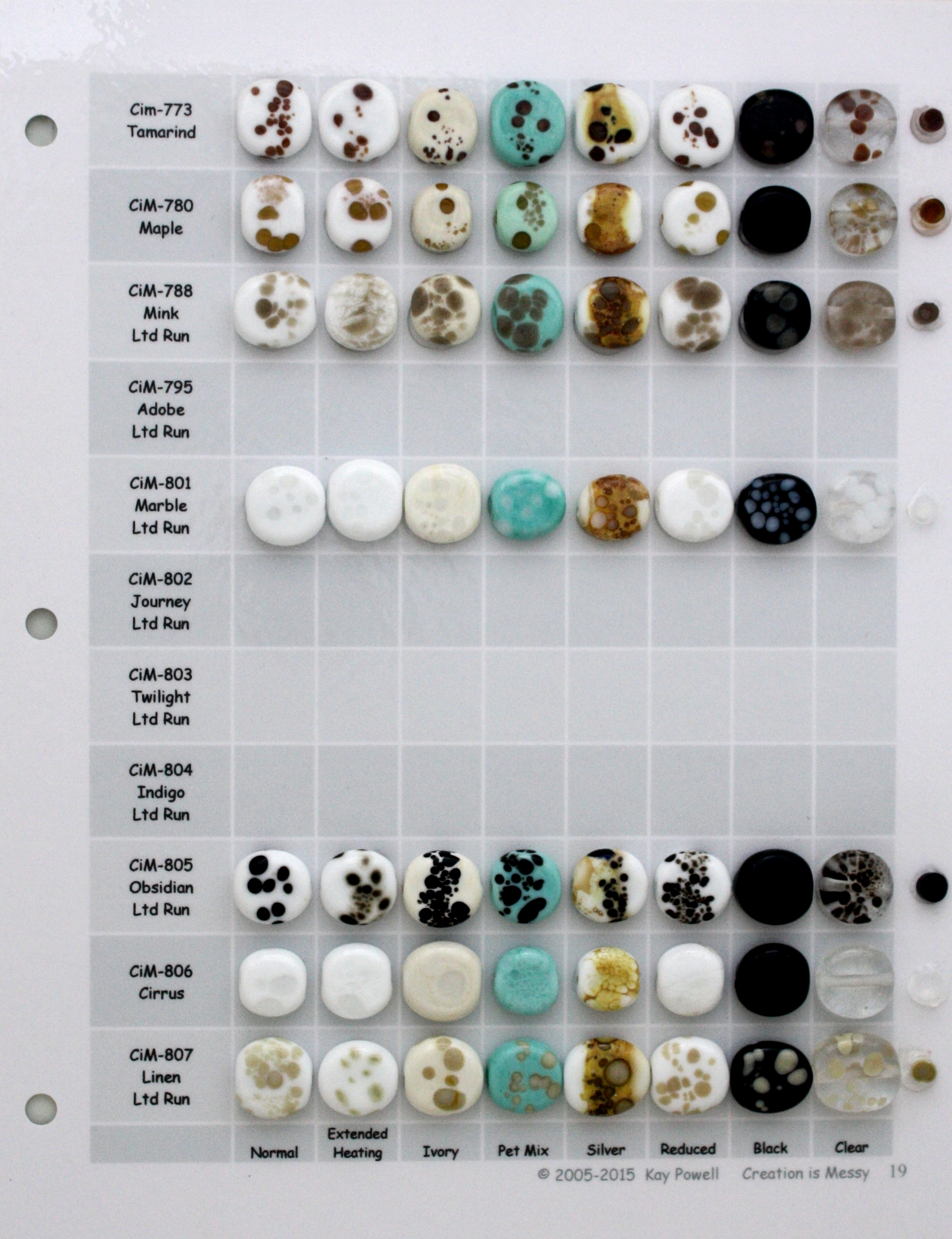
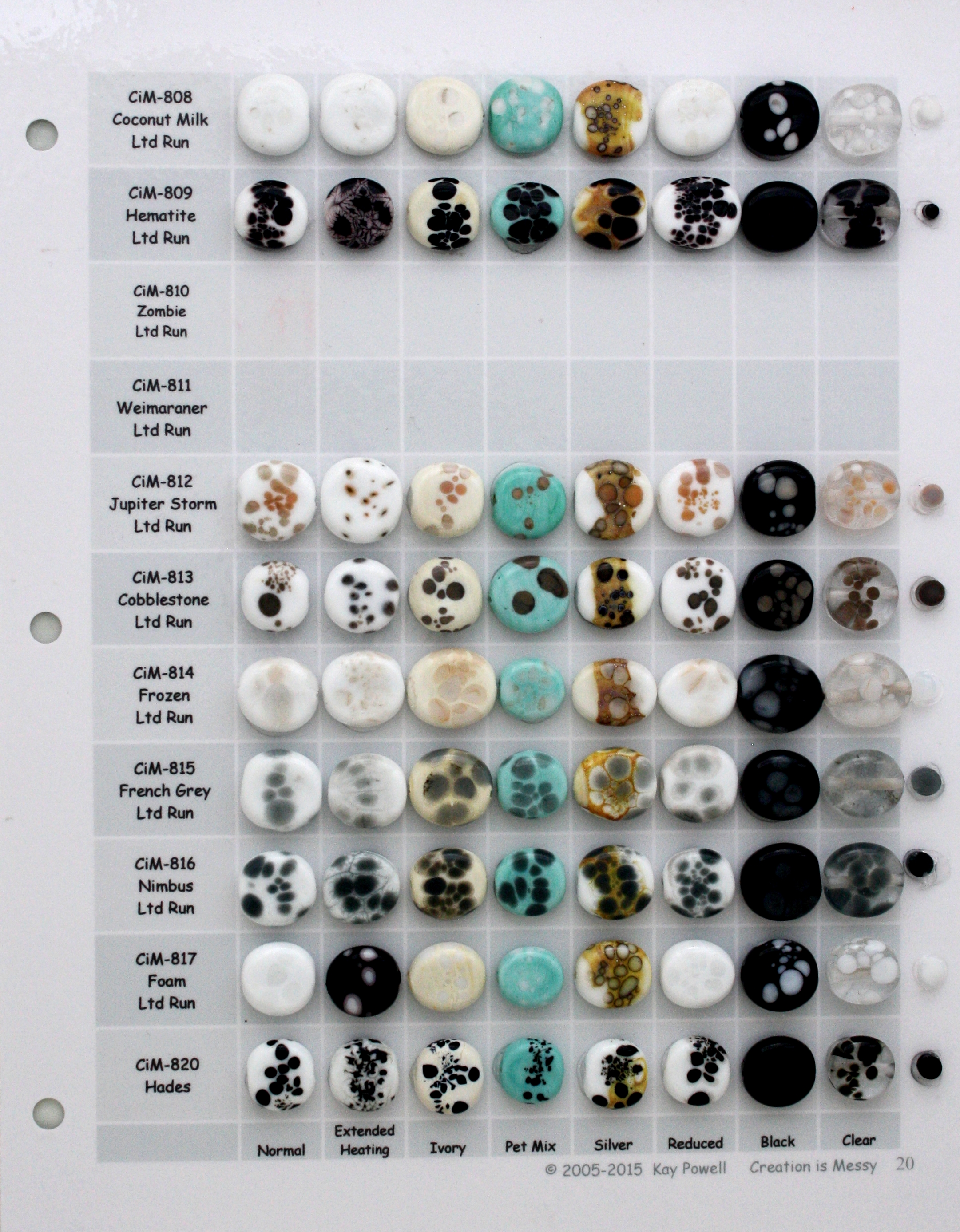
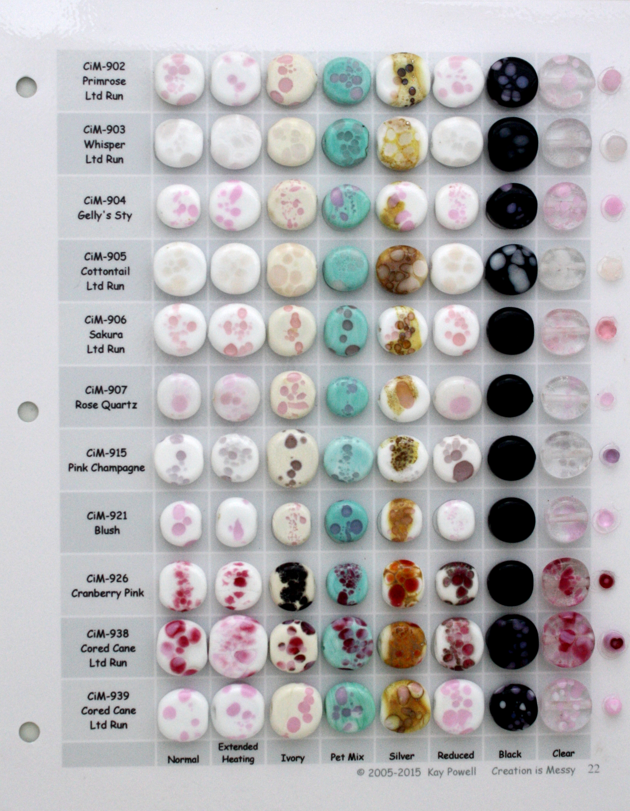
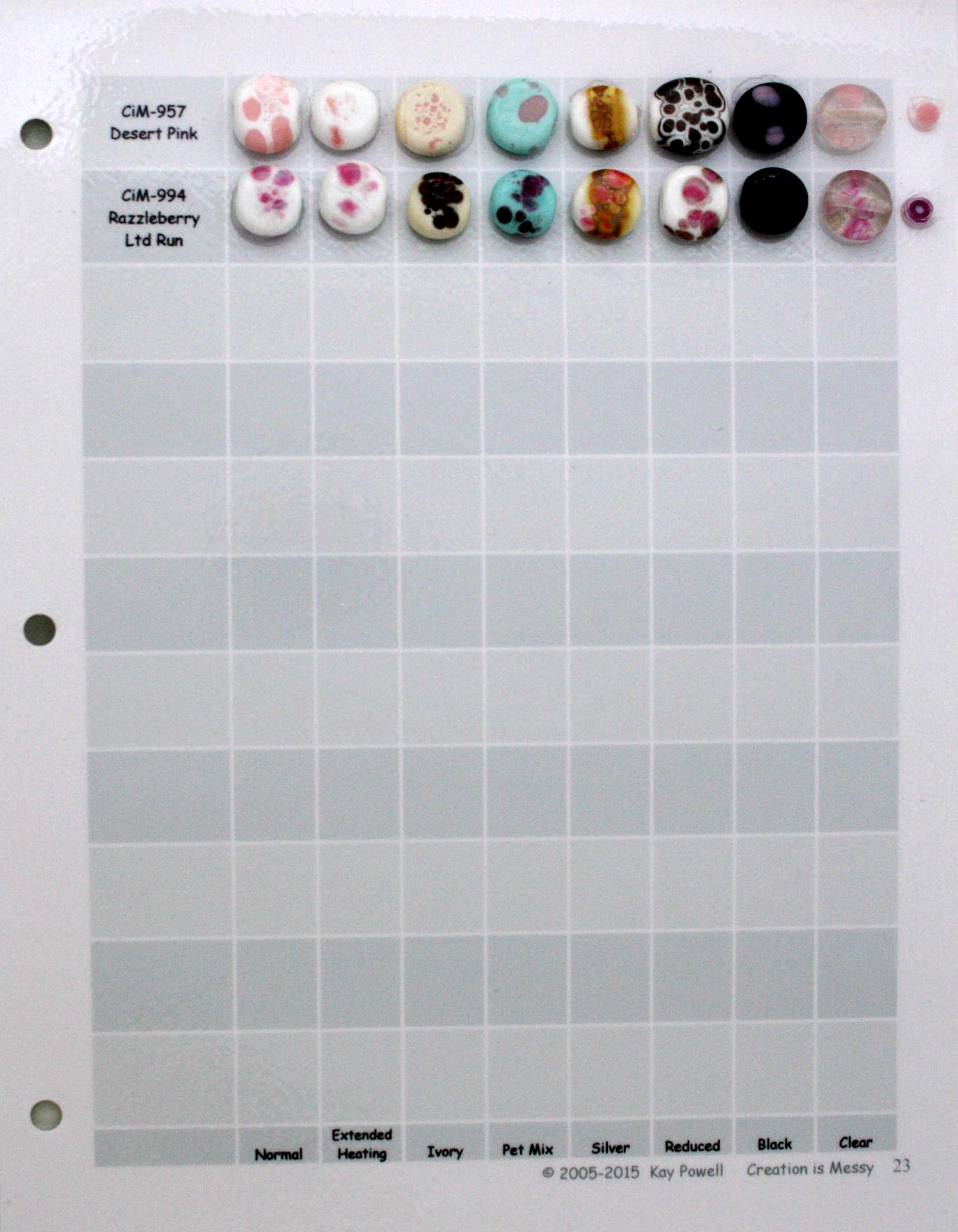
| 773-807 | 808-820 | 834-901 |
| CiM 22 | CiM 23 | CiM 24 |
 |
 |
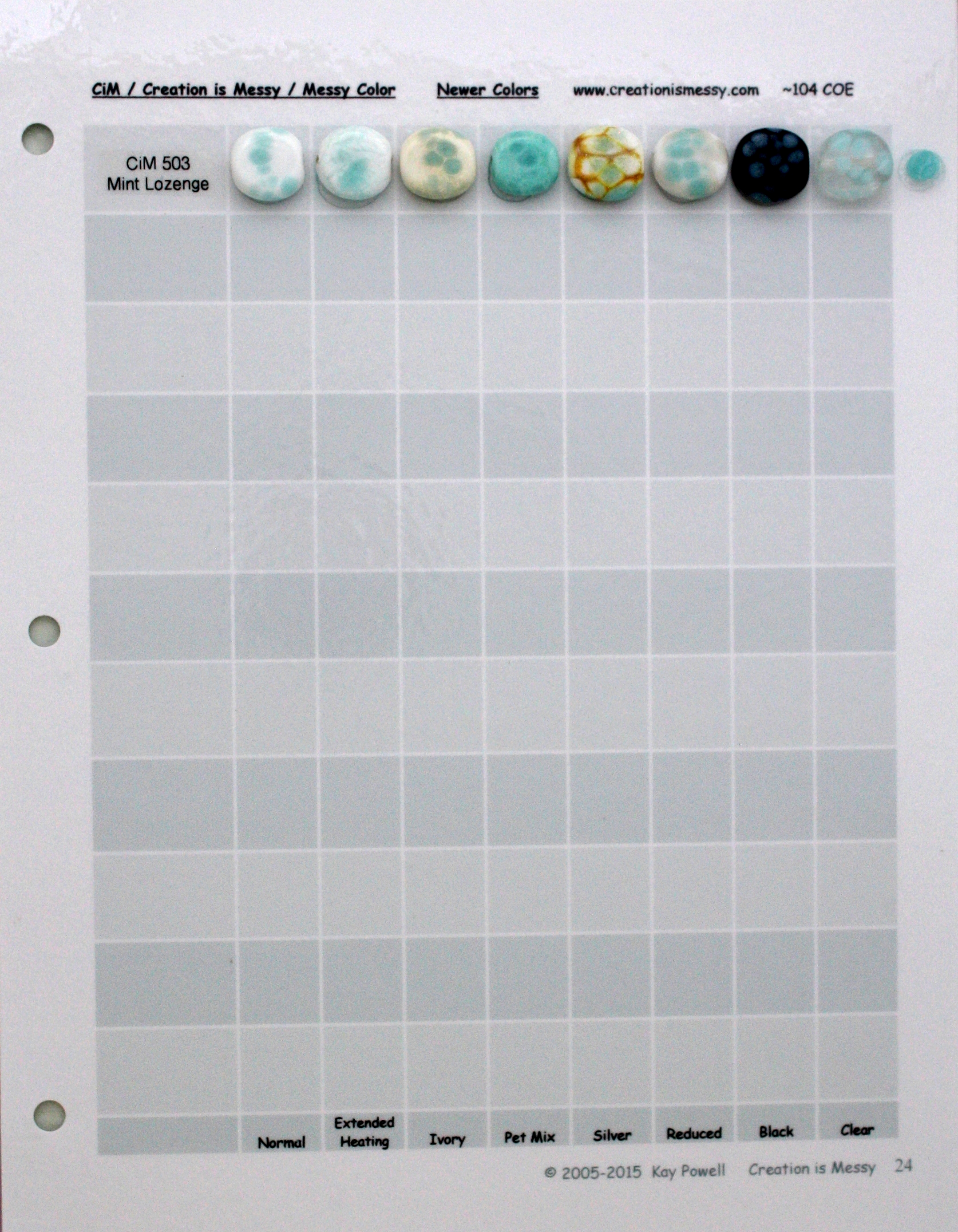 |
| 902-939 | 957-994 | Newer Colors |
It has been suggested to me by Amy Kinsch that this banding may be because they are striking colors that are partially in the unstruck stage. I did some tests on Cranberry Pink and it did strike to an even color. Bing and Schoolbus still show some slight banding, but did become more even. Lots of creative possibilities with this.
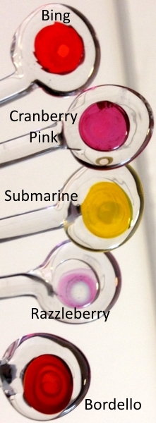
I chatted with Kathy and this is because all CiM colors are hand pulled, not done with a machine so there will be some variances in rods with color that strikes
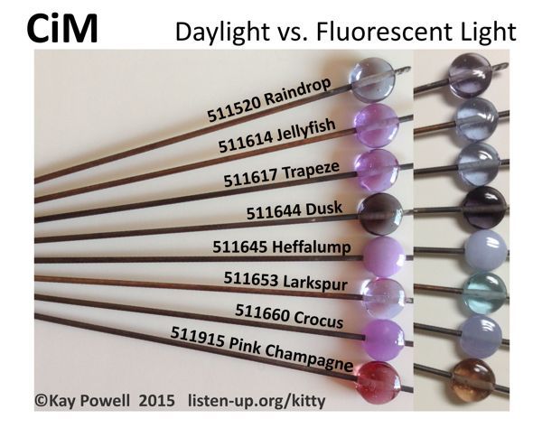
Light Sources Matter
When considering a light source for your studio, photography, or when doing a show, your light source matters.
You can contact Kitty by emailing her at kay@listen-up.org
© 2002-2023 - Kay R Powell. All rights reserved.